RESEARCH GOALS
The transport industry lacks a good data analysis dashboard that is generic enough like MS Excel which is not limited to data analysts, and feature-rich like Tableau but also incorporates machine-learning driven scenario exploration and visualisation.
Key research questions and areas:
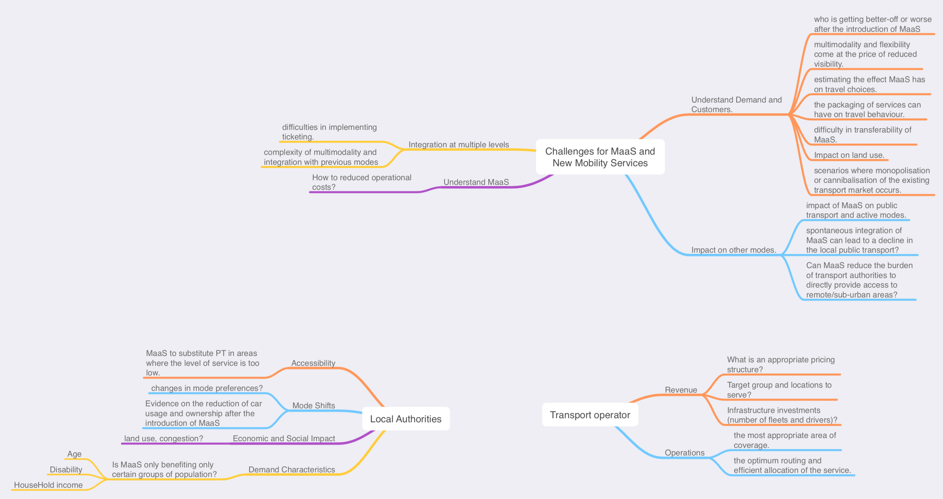
- What questions are transport operators and local authorities interested in?
- Observe and understand what are the set of basic interactions necessary to make a generic dashboard?
Deliverables:
- Presentation deck of research questions and recommendations for interactions in the dashboard.
- Wireframes of recommended designs.
My Role:
- Data Scientist & UX Researcher
METHODOLOGY
A 5-week field study to understand the analysis questions that transport operators and authorities need to answer. Participants were located across sectors (Modelling Practitioners, Data Providers, Government Bodies, Academia, Industry and independent consultants).
- Phase 1: Stakeholder Engagement (Initiated by senior members of the team).
- Phase 2: Organise Workshop and use as a platform to engage discussion and interviews.
- Phase 3: 2 weeks of curation of questions.
- Phase 4: 2 weeks of Dashboard research.
- Phase 5: Storyboarding.
- Phase 6: Wireframing of scenarios.
- Phase 7: Prototyping and Testing
OUTCOME: QUESTIONS OF INTEREST

DASHBOARD: INDUSTRY ANALYSIS
Exploration and deep dive was conducted for data dashboard tools used in the same industry sector.
![]()
DASHBOARD: INTERACTIONS IDENTIFIED
- The dashboard must have:
- A Selection Tool to filter data.
- Spatial Selection (If a map plot is used)
- X-axis or Y-axis Selection for (Line Plot, Bar Plot, Scatter Plot).
- The Dashboard must support combine Tool to merge data/plots:
- Combine tool can overlap plots if map plots are combined (of the same location).
- Combine tool can merge plots if a common axis is present.
- Combine tool can apply the selection to filter data.
- Combine tool can present two plots side by side if the axis is different or two different region.
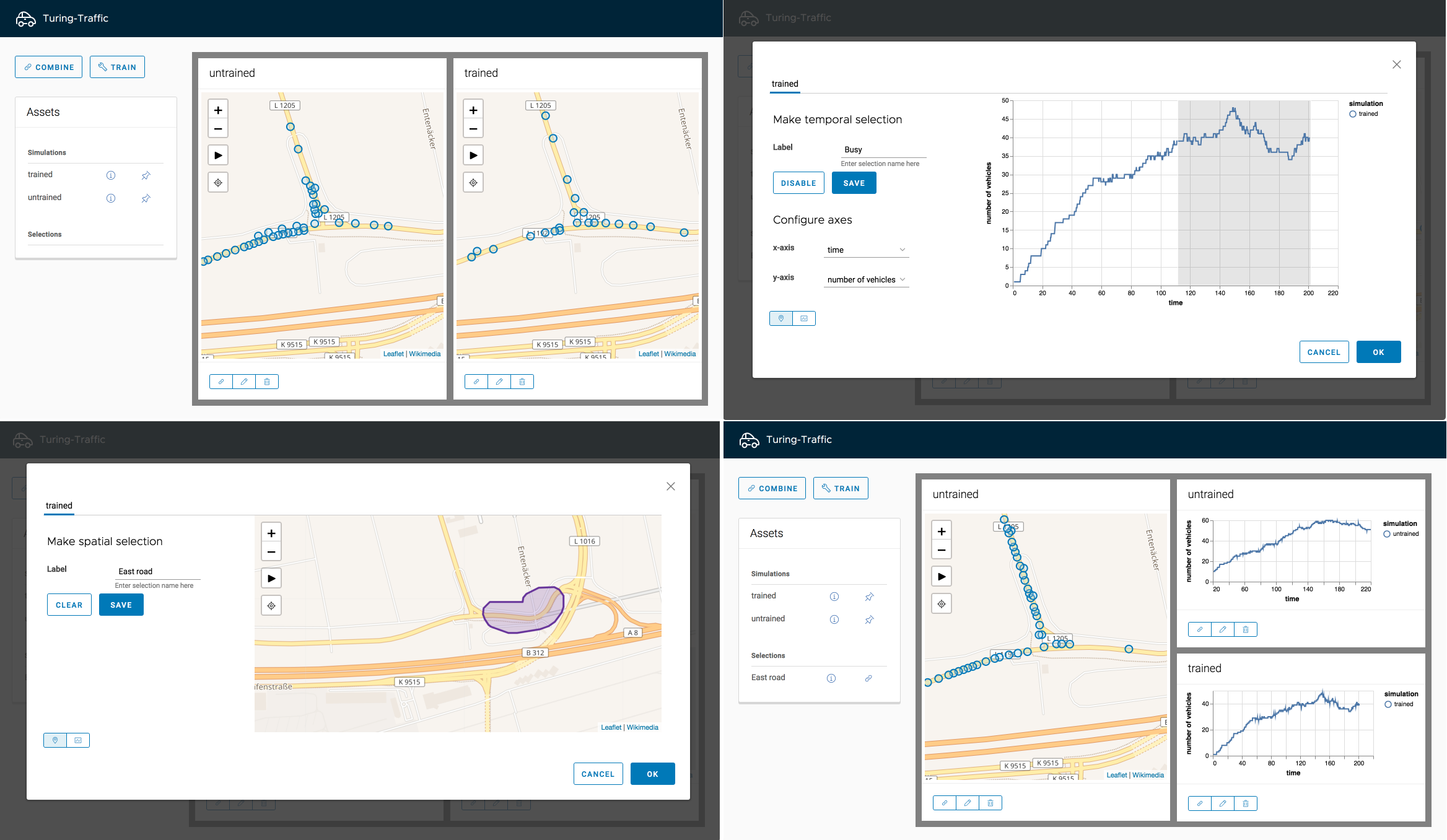
DESIGN & WIREFRAMES
Artifacts generated during the design steps:

PROTOTYPE

TESTING
The Final protoype was tested against targeted users with a background in transport modelling, academia and independent transport consultants.
- A Qualitative interview was done with users who tried out the tool and feedback was gathered for further improvements.